
In this article, you will learn How to Create Input Style with CSS.
Input with Icon or Image:-
<html>
<head>
<title>Input with Icon or Image</title>
<style>
input[type=text] {
  width: 100%;
  box-sizing: border-box;
  border: 2px solid #ccc;
  border-radius: 4px;
  font-size: 16px;
  background-color: white;
  background-image: url('search_icon.png');
  background-position: 10px 10px;
  background-repeat: no-repeat;
  padding: 12px 20px 12px 40px;
}
</style>
</head>
<body>
<h1>Input box with icon:</h1>
<form>
  <input type="text" placeholder="Search">
</form>
</body>
</html>
Animated Input:-
<html>
<head>
<title>Animated Input</title>
<style>
input[type=text] {
  width: 130px;
  box-sizing: border-box;
  border: 2px solid #ccc;
  border-radius: 4px;
  font-size: 16px;
  background-color: white;
  background-image: url('searchicon.png');
  background-position: 10px 10px;
  background-repeat: no-repeat;
  padding: 12px 20px 12px 40px;
  -webkit-transition: width 0.4s ease-in-out;
  transition: width 0.4s ease-in-out;
}
input[type=text]:focus {
  width: 100%;
}
</style>
</head>
<body>
<h1>Animated input</h1>
<form>
  <input type="text" placeholder="Search">
</form>
</body>
</html>
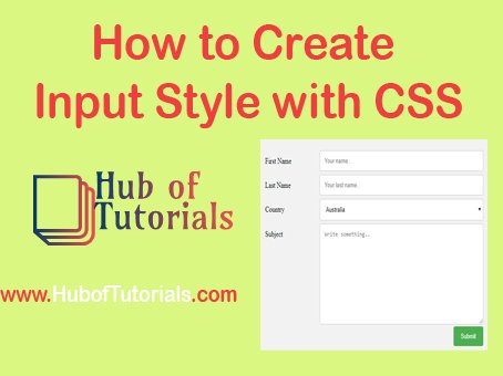
Responsive Form:-
<html>
<head>
<title>Responsive Form</title>
<style>
* {
  box-sizing: border-box;
}
input[type=text], select, textarea {
  width: 100%;
  padding: 12px;
  border: 1px solid #ccc;
  border-radius: 4px;
  resize: vertical;
}
label {
  padding: 12px 12px 12px 0;
  display: inline-block;
}
input[type=submit] {
  background-color: #4CAF50;
  color: white;
  padding: 12px 20px;
  border: none;
  border-radius: 4px;
  cursor: pointer;
  float: right;
}
input[type=submit]:hover {
  background-color: #45a049;
}
.container {
  border-radius: 5px;
  background-color: #f2f2f2;
  padding: 20px;
}
.col-25 {
  float: left;
  width: 25%;
  margin-top: 6px;
}
.col-75 {
  float: left;
  width: 75%;
  margin-top: 6px;
}
.row:after {
  content: "";
  display: table;
  clear: both;
}
@media screen and (max-width: 600px) {
  .col-25, .col-75, input[type=submit] {
    width: 100%;
    margin-top: 0;
  }
}
</style>
</head>
<body>
<h1>Responsive Form</h1>
<div class="container">
  <form>
  <div class="row">
    <div class="col-25">
      <label for="fname">First Name</label>
    </div>
    <div class="col-75">
      <input type="text" id="fname" placeholder="First Name">
    </div>
  </div>
  <div class="row">
    <div class="col-25">
      <label for="lname">Last Name</label>
    </div>
    <div class="col-75">
      <input type="text" id="lname" placeholder="last Name">
    </div>
  </div>
  <div class="row">
    <div class="col-25">
      <label for="country">Country</label>
    </div>
    <div class="col-75">
      <select id="country">
        <option value="India">India</option>
        <option value="England">England</option>
        <option value="Romania">Romania</option>
      </select>
    </div>
  </div>
  <div class="row">
    <div class="col-25">
      <label for="subject">Subject</label>
    </div>
    <div class="col-75">
      <textarea id="subject" placeholder="Type your Message" style="height:200px"></textarea>
    </div>
  </div>
  <div class="row">
    <input type="submit" value="Submit">
  </div>
  </form>
</div>
</body>
</html>
I love this post but just a tip… you should really write longer articles. I was sad this post ended, and I think your writing style would keep people really interested in what you had to say about all of this